Friday 22 October 2010

evaluation


College magazine evaluation

Our task was to produce a front cover for a college magazine and the draft of a contents page. The front cover had to include a masthead, a headline and a mid shot image we took ourselves.

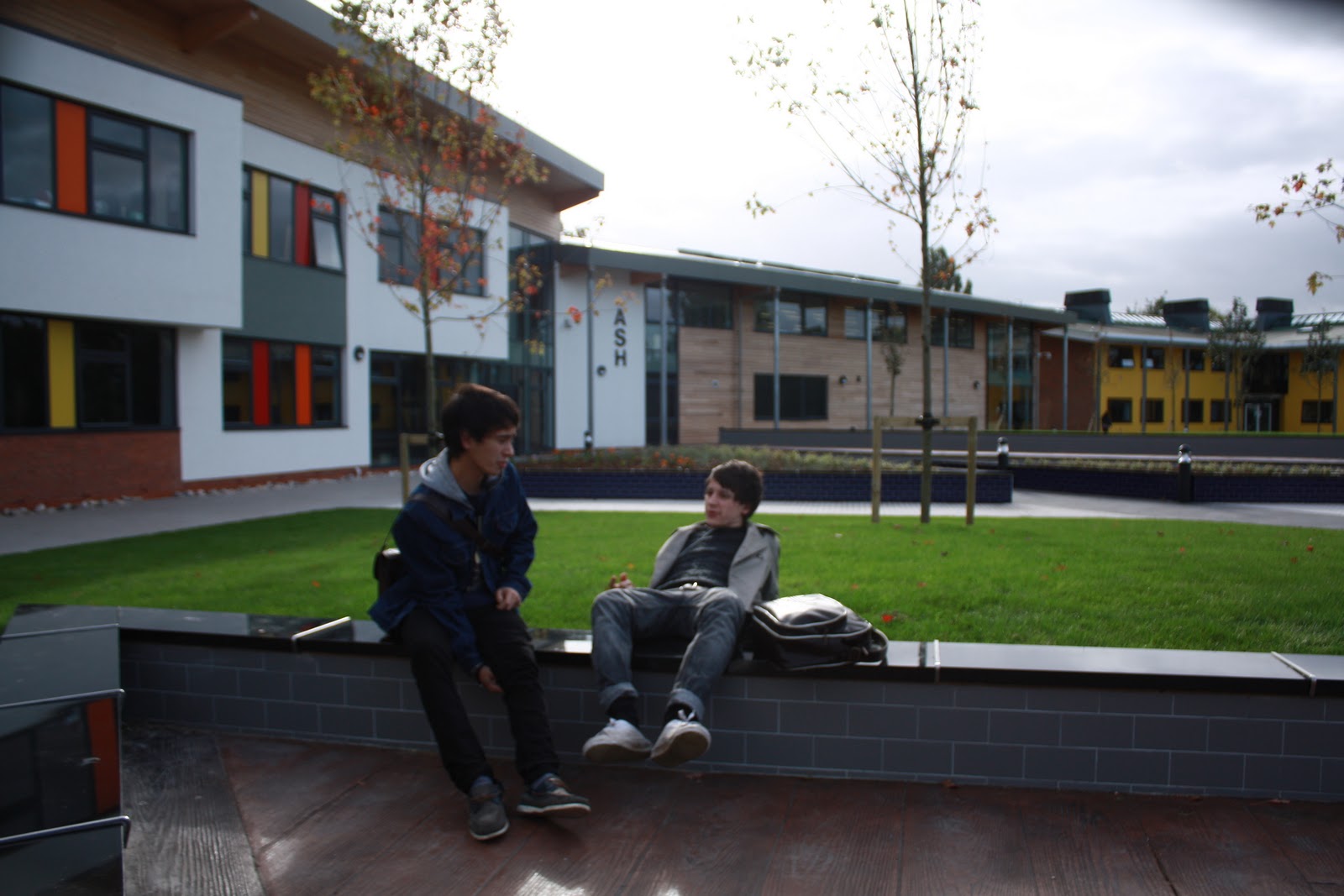
I used different types of media language on my magazine cover. I used a mid shot close up, this allows us to see emotion and representation of the students on the front cover, and this will hopefully represent the college and its students as friendly and happy, this is shown by the two students on the cover that look like they’re helping each other or just one showing the other something in a friendly manner. The masthead of my magazine is in purple and is very similar to the colleges font used for its logo, this sticks to the theme of Wyke. For my headline I also used purple as it is Wyke’s colours. The colour purple connotes royalty, this suggests the college is somewhat royal and a nice place to be. I have given the headline a shadow and made the font sharper to make it stand out.

The institution of the magazine would be Wyke College. It has been produced by a student at the college, me, for other students at the college.

The ideology of my magazine is too tell people that life at Wyke college isn’t scary and it is a happy friendly place to come and study. It shows that college students are friendly and respectable, they are proud to be Wyke students. The cover is meant to make people want to come to the college to study.

The target audience of my magazine is mainly Wyke’s newest students but it is for all students, and possibly even parents and staff. My magazine is suitable for any gender of lifestyle and the main age range would be around 16 to 20, but possibly older as well. This is shown by the two college students on the front cover who are aged 16.

My magazine represents both the actual college and its students as happy and friendly. It is represented as a good place to come and study. Both the college and its students and positively represented. I have created these representations by using a mid shot image of two students on the front cover; the mid shot allows us to see emotions of the students.  Also the purple colour font is quite a positive colour and connotes royalty, rather than a colour like black which would have negative connotations. It is important to create these representations because the idea of the magazine is to make people want to come to the college to study and if it had negative representations that message would not be portrayed.

Overall I think the task went well. If I was to do it again I would maybe change fonts or colours and the positioning of the text. I may have also experimented with a few different images on my front cover.

Wednesday 20 October 2010

Final products

This is my final front cover:


 This is my final mock up of my contents page:

Contents draft

These are a few draft ideas for my contents page:


These are some of the photos i may  of used on my contents page:


I believe these photos would give the college a warm friemdly feeling and they also show the beautiful new outside area.

Tuesday 19 October 2010

Idea development

I want my college magazine cover to show that college is a friendly place to be and a great place to come and learn. I want it to show that college life isnt daunting and scary, i will include in a mid shot image of a student to show this. I want my cover to be bold, bright and stand out to the reader and catch their eye. I want to include a interesting headline along with coverlines that will draw the reader in. When it came to chosing a name, I just wanted something simple and something which you could look at and automatically know what you are looking at.

These are a few photos I have taken and may include on my cover:


I like these photos as they show a friedly attitude at the college, the two students in the image are represented as friendly and helpful. They are mid shots that I have taken myself. I believe if a new student was to read the magazine, any of the images on the front cover would make the college look welcoming. Unfortunately i couldnt use some of the photos as they werent actually mid shots.


This is a draft for my front cover:


This is a rough idea of what i want my front cover to look like. When I come to produce my final product I will change fonts, colours and the positioning of certain things.

Thursday 14 October 2010

LIIAR brief of east riding college magazine

http://www.eastridingcollege.ac.uk/retrieve/f03377f297ba916aef8d41049589a9d1

The cover of the east riding college magazine is quite plain and boring, it is dark and doesn't particularly stand out. They have used a low angle shot of the college which is in colour but the rest of the magazine is white writing on a black background, this is called a reverse out.  They haven't used a sell line or a slogan on the cover and there aren't many cover lines and there isn't even a main head line although the masthead of the magazine does stand out on the black background. There isn't much lighting in the image and the overall cover of the magazine is too dark.

The magazine was produced by the college students. They want the magazine to inform other students and maybe even staff about things going on in and around college, but they haven't put enough information on the front cover. The ideology of the magazine is to make people interested in their college and want to go there to study.

The target audience of the magazine is college students or even parents and staff to inform them about what is going on in the college as it is a college magazine but this isn't portrayed on the front cover. The age range for the magazine would mainly be 16 - 20 year olds but as it could be for parents and staff it would be older as well. The magazine is suitable for both genders and any lifestyle.

On the cover of the magazine, the college is represented quite negatively as it is dark and quite boring. There isn't much going on this could suggest there isn't much going on at the college. It doesn't show how the colleges students are represented as there isn't any images of them.

Overall the cover of the magazine isnt very good. The information is limited, and it is too dark. The students who produced the magazine should of put more thought in to the cover, come up with a good USP and headline along with something to catch the readers eye.

Wednesday 13 October 2010

Analysis of college magazine.


https://blogger.googleusercontent.com/img/b/R29vZ2xl/AVvXsEjFtlYPTWCVuw-ZYwdAFwS1RIk4NjR4z50NNZ-d2p7HPDlo60vmWNLNAyuxlF2GYyaEg4Mx9SVKxYVRL1H9X_TkjEw9xi-9A3EXMFp6h5dObYJM6rFvA96Jwi8859Iil_NUpVms6ifxQu-R/s400/college-lifestyle-magazine.jpg

This college magazine uses a mid close up image of a student, this allows you to see that he is holding his books but you can also his emotions. You can see that he has a smile on his face, this suggests that he enjoys going to the college and he his happy with what he is doing. The models coat and jeans are black, the same colour as the background but he is wearing a bright white t-shirt which makes him strand out. The masthead of the magazine, is big bright and bold, this allows it to stand out to the reader. Various cover lines are also bright and bold so they stand out.

The institution of the magazine is the college itself. It involves information about the college and other topics which may interests students, as we can see from the cover lines on the cover. There are a lot of cover lines on the cover and makes it look busy as there is a lot going on, this could suggest that the college is a busy, working place.

The institution of the magazine has ideology, a system of shared ideas and beliefs. The ideology of this magazine is they want the college to look like a great place to come and study. A lot of the cover lines mention trips etc, which suggests they have fun as well as working.

The target audience of the magazine is obviously the students studying at the college. From the main image on the front cover we can see that this audience ranges from maybe as young as 16 to maybe late 20's. The magazine appeals to the students and lets them know what is going on in and around college.

From the front cover of this college magazine, the college is represented as a friendly happy place to be and to study at. The model on the front cover is represented as a happy student, someone who is proud to study at the college.

Friday 8 October 2010

LIIAR brief.

L - language. This refers to the media language that is used in the text. Media language is camera angles, the editing, the sound, the lighting and mis-en-scene etc. Examples of media language I will use to create my college magazine are; the masthead, this is title of the magazine. The main cover line, this is the main headline on the cover of the magazine. The image, this will be a medium close up we have taken ourselves and a cover line, this is the smaller headline for a story inside the magazine.

I - institution. The institution refers to the company that has produced the text. For example the institution of a NME magazine is, NME. The institution of my magazine would be Wyke college.

I - ideology. The ideology of a company is a system of shared ideas and beliefs. The ideology of a college magazine would be to

A - audience. This refers to the target audience. The target audience is the age group which the text is aimed at. The target audience of a college magazine would be college students, aged roughly 16 - 20 or maybe even the staff. The magazine would have to appeal to the students staff at the college.

R - representation. This refers to how something is percieved, age, gender, sexuality, ethnicity etc. For example a woman may be represented as small and weak or a group of youths may be represented as thugs. A college magazine will represent the college and its students. A college magazine should have a positive representation, this would make it appealing as it is represented as a good place.

Wednesday 6 October 2010

college magazine- task brief

Our task was to create the front cover of a college magazine and the draft of a contents page. The front cover has to include a masthead, a headlining story and a photo we have taken ourselves. As the contents page is a draft we only have to show were our pictures and text would go.