Friday 17 December 2010

Final front cover.


This is the final draft for the front cover of my music magazine. On the last draft you couldn't really see the writing so I made the font white and added a black outline, this really makes it stand out and grabs the readers attention. The masthead and headline also have an outline. I added another sell line so the cover didn't look empty and  I like the way everything is positioned. I am really happy of this to be my final front cover.

Photoshop drafts for front cover


This is the first draft I did for my front cover. I really like the positioning of everything but the only problem is the colour of some of the text as you cant see it clearly against the background.


This is the second draft I did. I changed the colour of some of the writing, added a sell line and added a banner at the bottom so you could see the writing with more ease. However you still couldn't see some of the writing and I think it didn't look right because a lot of the writing was the same colour. I think it also needed atleast one more sell line.

Thursday 16 December 2010

Pictures for double page spread.

These are some of the images I took to feature on my double page spread.


I don't particularly like these two pictures because of the background and also because of the way they are stood. I asked them to stand against a brick wall so that was the only thing in the background and took some more pictures.


These two images are practically the same, just the way some of the band members are stood is slightly different. I like the brick wall they are stood against and I like the lighting of the picture. I am going to use one of these two on my double page spread.


Pictures for contents page.

These are some of the images I want to use on my contents page to represent the artists featured in my magazine. 


I like this image but I think the camera is just a little too close however I do like the pose and the background.


I like this image as it show the artist playing his instrument but I dont think it looks like it was for a magazine.


I like this image as the camera isnt too close and the pose and background are same as the other. I have to chosen to use this on on my contents page.


I also chose to use this picture on my contents page to represent the main band featured.


Wednesday 15 December 2010

Pictures for front cover.

Here are some of the images I took to use on my front cover.


Initially I wanted to use a picture of the whole band on my front cover but after taking these two I decided not too as I dont really think they would work and they also arent very good pictures. I then chose to use just one band memeber on my front cover.


This is thee first picture I took of band member Karim. I really like the pose of Karim however I didnt like the background so I put a poster behind him.


This is the first image I took with a new background, I really like the background however I dont really like his pose or facial expression.


For this image I asked karim to pose similar to the other photo. I really like this one, I like his pose and how he is postioned on the backround.

Wednesday 8 December 2010

Chosen name.

The name I have chosen for my music magazine is 'New Era'. I have chosen this because I like the way it represents what the magazine is about, new and upcoming music. I also think it represents the target audience for my magazine, teens to early twentys, as it sounds quite trendy.

Here are a few font ideas for my name;


My two favourite of the above are the top one and the bottom one. I like the top one because it is quite messy and shows the messy lifestyle of teenagers and musicians, it could also represent the type of bands wich will appear in my magazine. I like the bottom one because it looks new and trendy and also represents the music and artists featured.

The font I have chose to use is the bottom one, Roadway.

Digital double page sread drafts


This is the first draft for my double page spread for my music magazine.


This is the second draft for my double page spread.


This is the third draft for my double page spread.

Digitial contents page drafts


This is the first draft for a contents page for my music magazine.


This is the second draft for my contents page.


This is the thrid draft for my contents page.

Digital front cover drafts


This is one draft one a front cover for my music magazine.


This is a second draft for my music magazine.


This is the third draft for my front cover.

Hand drawn drafts for double page spreads


This is the first hand drawn draft for a double page spread for my music magazine.


 This is the second draft for my double page spread.


This is the third draft for my double page spread.

Hand drawn drafts for contents page

This is the first hand drawn draft for my contents page.


This is the second hand drawn draft for my contents page.


This is the third hand drawn draft for my contents page.

Hand drawn drafts for front cover


This is the first hand drawn draft for my front cover.


This is the second hand drawn draft for my front cover.


This is the third hand drawn draft for my front cover.

Name ideas

Here is a bainstorm of some names I may call my magazine. I want the name of my magazine to portray new and upcoming music.


These are some fonts I like and would use on the front cover of my magazine. I like the name 'New Era' and the font of it. 'New Era' shows that the magazine is about the newest music out and the font of it connottes the messy lifestyle of teenagers and possibly the bands featured. 

Initial magazine ideas.

Front cover:
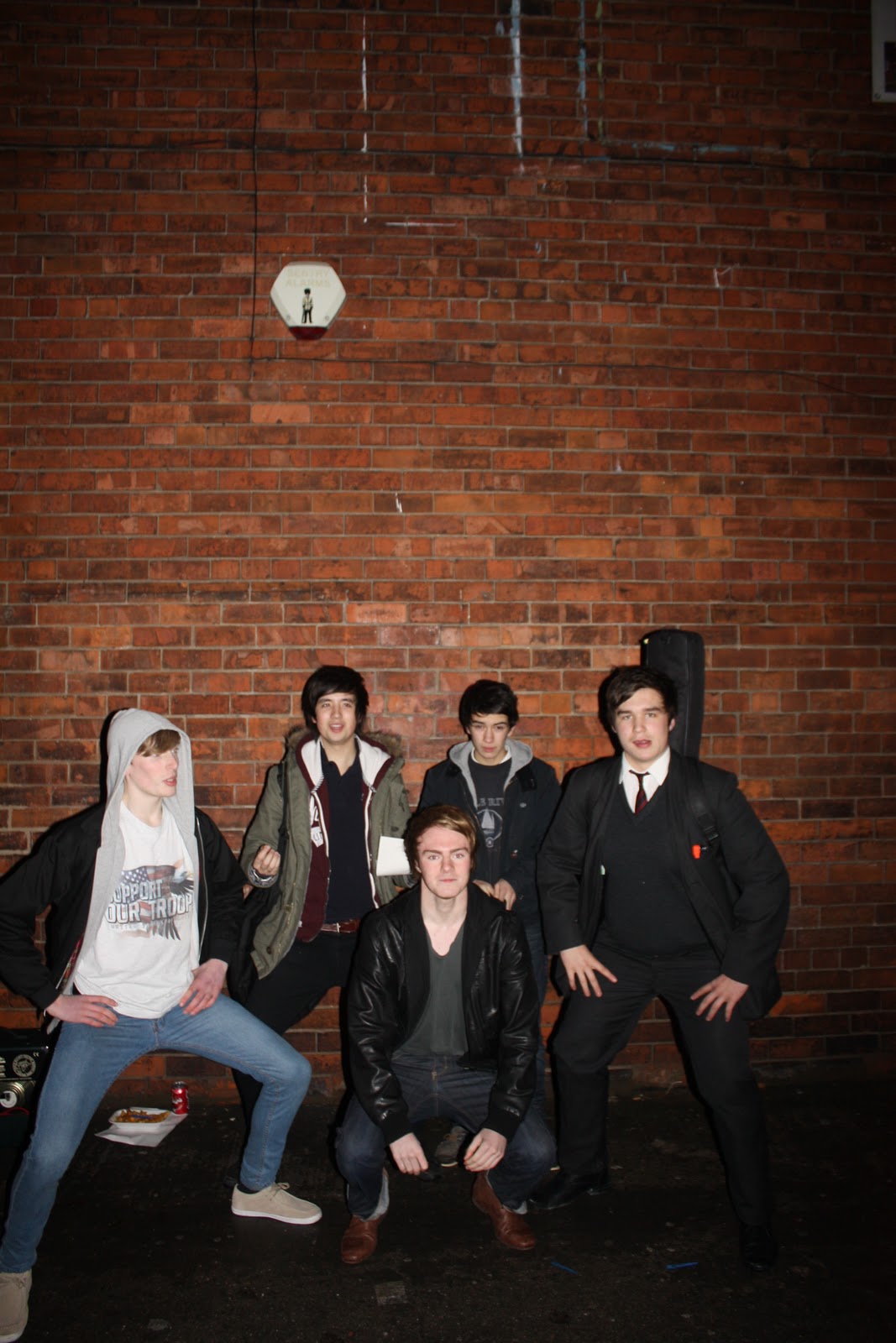
I want the front cover of my music magazine to co note the somewhat messy lifestyle of teenagers and maybe the bands featured but I also want it to represent the newest music artists around. I want it to be quite plain and simple although messy enough to connote the messy lifestyle of teenagers etc. My masthead. headline, kicker, pull quotes and sell lines will be bold and stand out to the reader. I will use a low angle mid shot of the band on my front cover, this will make them look important and dominant, this will also give us a good idea of what they look like.

Contents page:
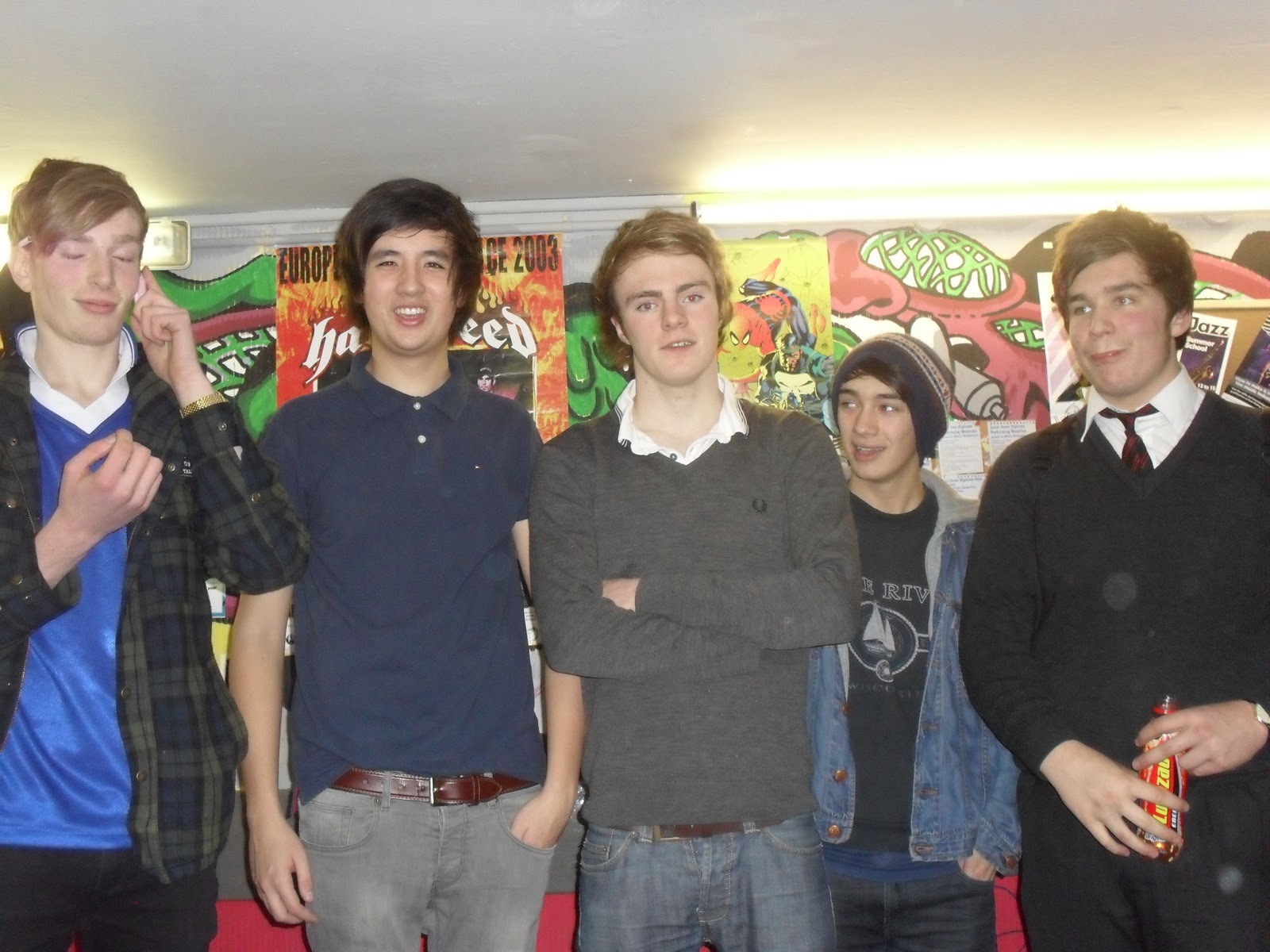
I want my contents page to be similar to the front cover but I want it so the readers will easily be able to find their way around the magazine and find what they want. I don't want loads of writing on my contents page, just enough to tell the reader what is featured in the magazine. I would also like images of bands featured on the contents page.

Double page spread:
Like both my contents page and front cover I want my double page spread to represent the newest music artists around and connote a messy lifestyle. I want to have one big image on one page of the band featured and a small article about them on the other page. I want to use a reverse out and half white writing on black background, this will make the writing stand out to the reader. I am going to use a low angle long shot of the band to make them look important and dominant in the music world. As i am using a new band in my magazine it will make them look like they are something to be scared of. I want my double page spread to make the band look like they are something for people to look up to but also make people want to go and see them or buy there Cd's.

Colour scheme:
My magazine isnt going to be really bright and be full of neon colours but it isnt going to be all really dark colours however it will have browns, greys, reds, blues, whites and blacks.

Friday 26 November 2010

price and how often published

Similar to NME magazine, my own magazine will be published once a week to allow the readers to eaily be updated on the latest and best music. It will be priced around £2.50, this isnt too expensive and will allow the main target audience of teenagers to buy it as they will be able to afford it. It will also be affordable to people in their early twentys who may be classed as middle class citizens and may not have a well payed job or any job for that matter, but as long as they have some money coming in they will be able to afford it.


My target audience

The target audience for my music magazine would be mainly teens too early twentys and fans of indie music. However my magazine would also apeal to an older age range if they were to like the genre of music featured. My target audince would be one similar of NME's as NME and my magazine are of the same genre and will feature the same type of bands. The main age range would be roughly 16 - 25 as this age range tend to listen to a lot of indie music whereas the older generation dont listen to it as much. My magazine will apeal to all social classes as it will be afordable for them all. My magazine will also be mainly aimed at people who have an interset in new and upcoming indie music. By looking at the physcographics of my target audience I am able to know what style of magazine my target audience would like, ie teens/students would generaly want an indie music magazine as they have their own style and listen to indie music.

Thursday 25 November 2010

My magazine genre.

The genre of my music magazine will be indie. I am chosing this genre as it is my favourite and I know what people will want to see in the magazine. Indie is a very popualr genre so I think my magazine will apeal to a lot of people and have a large target audience. My magazine will be similar to NME as it is of the same genre and will feature similar artists. Indie music was featured in most of the magazines I reseatched, this shows how popular the genre is. A lot of new and upcoming bands are indie/indie rock, because of this my magazine will feature the newest indie band(s).

The band(s) featured in my magazine will be similar to: Arctic monkeys, Block party, Crystal castles, The drums, The kings of leon and Vampire weekend, who are all indie/indie rock bands.

Q double page spread analysis


This is a double spread from Q magazine featuring the band 'The kings of leon'. There is little writing and a big piciture. The image, on the right hand side, is a long shot of the band, this allows us to see their whole body and what they are wearing. The two headings are in a different colour to the rest of the writing and are bigger so they stand out. The articles themselves are in white on a black background, this is called a reverse out.

The institution of this double page spread is Bauer or Q magazine. The same as the front cover.

The ideology of this double page spread is to inform and tell the reader about the band featured and send out a possitive message about them so the readers continue to read and then go out and listen to the band.

The target audience of the double page spread is fans of the band featured, 'The kings of leon', teens and the older generation, all the same target audience for the front cover.

The double page spread represents the genre and style of the magazine as well as the band featured and target audience of the magazine in general. This is shown from the image of the band.