Music magazine evaluation
Our task was to produce a front cover, a contents page and a double page spread for our own music magazine. Before we made our magazine we had to research several other music magazines to find out what makes a good or bad music magazine. We were only allowed to use pictures that we had taken ourselves but we could then edit them using adobe photoshop.
My front cover is a conventional magazine as it features all the aspects of most music magazines. The masthead of my magazine is quite a bright green, this connotes masculinity and implies wealth but its also a relaxing colour and is easy on the eye, it is also bold, this will make it stand out to the reader and grab their attention. It is also placed in the top right corner, so if my magazine was stacked on a shelf the masthead would be seen straight away. This is similar to ‘NME’ magazine who always have their masthead in the top right corner. The font of the masthead is also quite a trendy font which would definitely appeal to my target audience. The name ‘New Era’ represents the new era of music which is featured in my magazine. On the cover I have used a mid shot of the lead singer from the new indie band ‘The Beatknicks’. I dressed the model in trendy indie styled clothing which appeals to not only my target audience but the genre of the magazine and all the other bands featured. The model on my cover has quite a stern look on his face and his looking away from the camera, this makes him look quite cool but it also makes him look slightly arrogant suggesting that he knows his band are good. He is stood in front of a modern abstract painting which appeals to the audience as it is cool it is also apart of the mis-en-scene of my front cover. The headline on the front of my magazine is ‘The Beatknicks’ this is the name of the main band featured. The font, like the masthead, is quite a bright green and it has a bold black outline. This really makes it stand out to the reader and draws them in making them want to read about ‘The Beatknicks’. The kicker on my front cover ‘Bassist Karim Skalli simply kept the crowd pleased’ suggests that they are a good band and play well at gigs. This will make the reader want to read about them and even listen to them. This is synergy as my magazine is getting people to listen to the bands music. The subheadings on my cover are in white with a bold black outline creating continuity as the masthead and headline are the same as this. It makes them really stand out to the reader. Both of the subheadings appeal to my target audience as they are about the months hottest gigs, and a new indie band. Teenagers enjoy going to gigs and will want to know about new bands as they are fans of the genre. I have used a little banner across the bottom of my cover which lists a few of the artists which are also featured inside the magazine. All the artists listed are of the same genre and will appeal to my target audience.
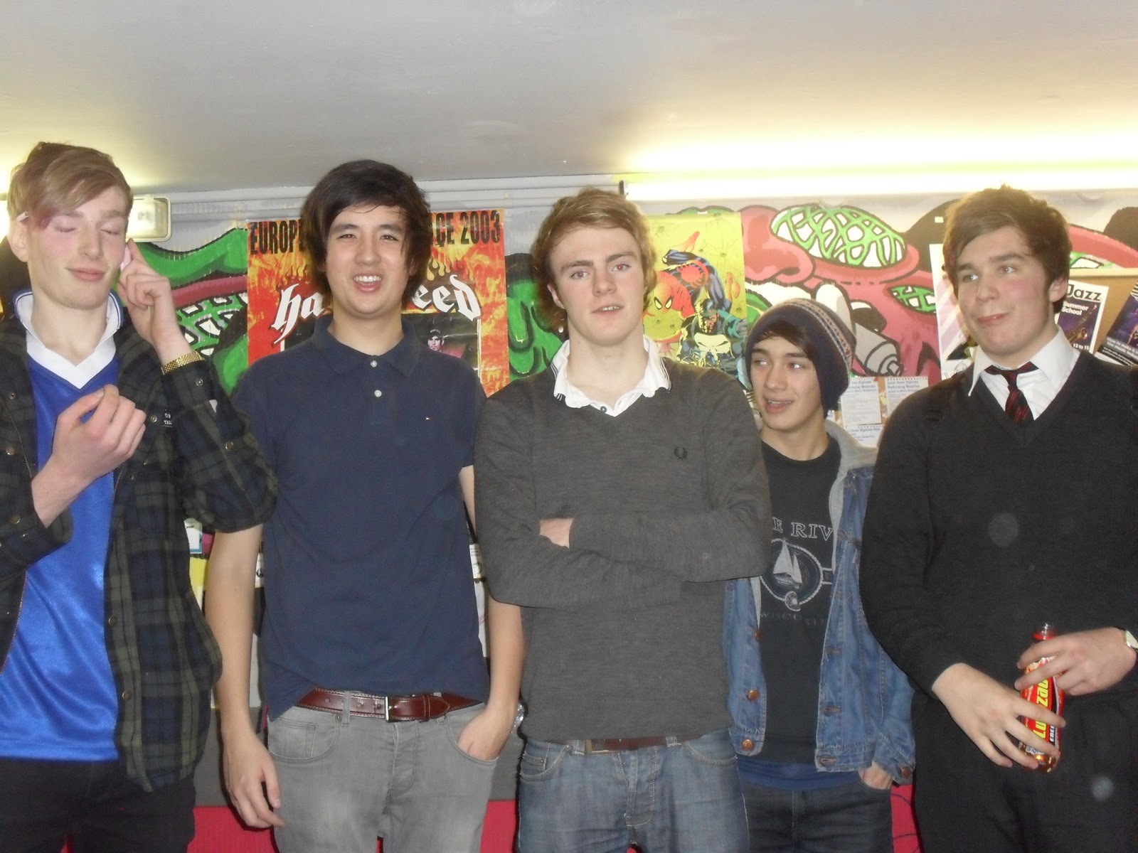
A contents page is a very useful thing to have in your magazine. It helps the reader navigate around your magazine and if there is a certain thing they want to read all they have to do Is look for the page number and they can go straight to that article. In my contents page I have used regulars and features. The regulars appear in the magazine every week when it is released whereas the features are special to that particular edition. Regulars of my contents page include; news and reviews but what comes under these headings are features as the content of the magazine will change every week. The features of this editions contents page are; articles on different bands. The masthead of my contents page does stick to the same theme as the front cover so this is conventional. It is the similar colour, bright green, so this makes it stand out to the reader. The subheading on my contents page are also in the colour green, this makes them stand out a lot more then the other text on the page. I have used three images on my contents page, both of the images relate to articles featured inside the magazine. One image is a full band picture of The Beatknicks, who are also featured on the front cover, another image is of ‘Michael Uney’ which relates to one of the magazines features and the last image is of the ‘Arctic Monekys’ who are again featured in the magazine. All of the images represent my target audience as they are young trendy bands/artists. For the image of ‘Michael Uney’ I have used a medium shot so we can just see the top half his body and his head, this allows us to see his facial expressions slightly better. For the image of ‘The Beatknicks’ I have used a wide shot of them on stage so we can see all of them while they are performing, and the image of the ‘Arctic Monkeys’ is a medium shot so we can see them all from the waist up. I have put numbers on the images so if the reader wants to go straight to the article about that band they can see the page number and don’t have to look through the whole contents list until they find the page they want.
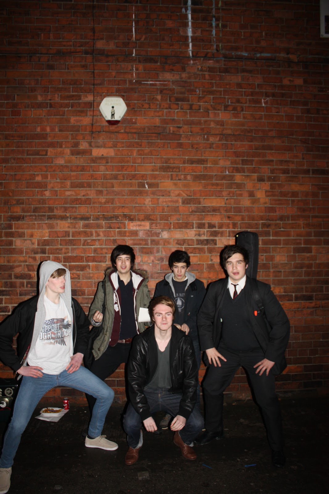
My double page spread is about ‘The Beatknicks’ who are the main band featured in my magazine, they are also featured on the front cover. Half of my double page spread is a long shot of the band, this allows the reader to see all the band and the other half is an article about the band. The front of the article is white and it is against a black background, this is called a reverse out, it will also make the article stand out. In the image I have used of the band most of the members are standing in silly poses and it looks they’re just been daft, this could represent the nature of the band, as they are laid back and cool about everything and they just take everything in their stride. They are also stood against a brick wall in the street, this conotes they are like the cool kids hanging about on the streets, it could also suggest they are the ‘new kids on the block’. The main headline of the double page spread is in big bold white writing which really stands out against the brick background. I have used a pull quote from the article underneath the headline and the word ‘best’ in the pull quote is black whereas the rest of the pull quote is in white, this makes the individual word stand out.
My media product represents the social group of teenagers are they are the target audience for my magazine. I have used a young trendy lead singer on the cover and trendy indie bands inside of my magazine which represent the social group of teenagers are a lot of teenagers are in to that kind of thing. When I asked a group of 20 teenagers at my college 80% of them said they would buy it. I think the price for my magazine, £2.50, is a suitable price for the target audience of teenagers as it isn’t too expensive and they would be able to afford it. My target audience could fall under any category of social economic status as it would be affordable to them all and may appeal to them all.
The type of media institution that might distribute my media product would be a smaller institution, like IPC who publish NME, as my magazine isn’t a big mainstream one. My magazine is all about smaller indie bands on the upraise. My magazine would probably be sold at gigs or in record shops, or even as an insert in another magazines like NME which is of the same genre.
The target audience for my music magazine would be mainly teens too early twenty’s, about 16 – 25, and fans of indie music. However my magazine would also appeal to an older age range if they were to like the genre of music featured. My target audience would be one similar of NME's as NME and my magazine are of the same genre and will feature the same type of bands. The main age range would be roughly 16 - 25 as this age range tend to listen to a lot of indie music whereas the older generation don’t listen to it as much. My magazine will appeal to all social classes as it will be affordable for them all. My magazine will also be mainly aimed at people who have an interest in new and upcoming indie music. By looking at the physcographics of my target audience I am able to know what style of magazine my target audience would like, ie teens/students would generally want an indie music magazine as they have their own style and listen to indie music
On my music magazine I have used a lead singer from a young trendy indie band on the front cover, this will attract my main target audience of teenagers and fans of indie as they will either like this band already or what to know about them. I have also used bright colours and bold letters which stand out to my audience and draw them in. I have also used tag lines like ‘this months hottest gigs’ which will appeal to my audience and make them want to read it. I asked 20 students at my college aged 16 - 18 if they thought my magazine stood out and 16 of them said yes, the other 4 said no. this tells me that I may need to make a few alterations in order to make it stand out to all of the students I asked.
From making this music magazine I have learnt how to manipulate images using photoshop. Photoshop really helped when it come to making my magazine. I was able to take my photos using a DSLR camera and then import them on the computer and edit them on photoshop. Especially on my front cover I added a lot of text on top of the picture using photoshop. Once you have typed your text you are able to move it about, change the size of it, change the colour of it and even add outlines anc various effects such as drop shadows. I have also learnt how to use blogger while making my music magazine as I had to post everything on there. On blogger you can post images, text and even videos. While making my magazine I had to post research on other magazines, drawn drafts, ICT drafts, colour schemes, fonts, name ideas and everything else in order to make my magazine. While using blogger when uploading photos a few problems occurred; it was really awkward to size photos and put them in the right place, and sometimes it wouldn’t let you upload more then one photo at a time.
From doing our preliminary task, the college magazine, I learnt all the conventions of magazines and all the terminology (masthead, headline, splash etc). This really helped me when it came to making my music magazine. Although I think when I was making my college magazine I was more limited then when I was making my music magazine as music magazines have a much wider audience and as I am a fan of music I will know what people want to see. However the college magazine was great practise for me as I knew what I was doing and knew how to layout magazines properly and what type of images would work best on front covers.
In order to get audience feedback for my magazine I asked 20 students in my college, ages 16 – 18, a series of questions. The majority of the feedback I received was positive and at least 80% of the 20 students liked my magazine and said they would buy it. However I did receive some negative feedback, especially on my contents page. One student said ‘it doesn’t look professional’. But I will use the negative feedback to help me improve my magazine. From receiving audience feedback I have completely changed my contents page as it is the one piece of my magazine that everybody said wasn’t as good as the rest. I also used the feedback to slightly alter other aspects of my magazine.
Word count; 2,144